Just letters or an image with text? Round or square? Green, blue or yellow? Photos or illustration? Anyone who is serious about brand identity puts these decisions at the end of the exciting process. After all, there is more to developing or revising your corporate identity than just coming up with nice, contemporary visuals. A visual make-over is tempting because it can be implemented quickly and cost-effectively, but this has little to do with the long-term development of a successful brand. In order to achieve that, branding needs to be in line with the comprehensive understanding of a company, its values, goals, vision and its in-house philosophy.
In a competitive environment that forces companies to become increasingly similar to one another, it is important to communicate clearly and authentically. With identical offers, the “who” and “why” often decides who customers trust to provide them with optimal support. Only those who are mercilessly honest with themselves and their customers will be successful in the end. Disappointing experiences with a company, on the other hand, almost automatically drive customers into the arms of the competition. After all, the competition has almost the exact same thing to offer.
REBRANDING DOES NOT SERVE THE SHORT-TERM SALES INCREASE
Branding or rebranding is not about increasing short-term sales or satisfying the current needs of a target group. Successful brands better manage to build trust with their customers, create their own identity and clearly set themselves apart from the competition. Ideally, a brand remains recognizable for decades, even if it changes, realigns and moves with the times. In essence, it remains true to itself. It is not for nothing that we speak of corporate identity – in essence, it is the company’s personality.
The visual level, the corporate design, is only one facet of the whole. It makes the individuality of the company visible, but it only works when combined with the entire internal and external communication of the company: the language (Corporate Language or Tone of Voice), its activities (Corporate Behavior) and the corporate culture. Only when all these personality traits are developed and lived out can the company achieve an authentic and therefore strong profile, thus establishing its own personality.
The reasons that can lead to the decision to engage in rebranding are diverse. It makes sense, for example, if the appearance of a company no longer reflects its identity.
For pressrelations, the rebranding decision was made for this exact reason. We had evolved as a company, expanded our portfolio, and set new priorities. It was, therefore, time to make this change clearly visible to the outside world.
REBRANDING – HOW DOES IT WORK?
For a rebranding process to succeed, it is important to involve as few people as possible, but as many as necessary. In the run-up to the process, one should, therefore, ask: Who has a special interest in the success of the brand development process? How and by whom are the decisions made? What time is available? Who has the knowledge and perspectives that will help create a comprehensive picture of the company?
Not only the internal view of the company is important – the voices of customers and partners are essential. The comparison of self-perception and external perception is a very exciting and informative intermediate step in the analysis process. Company strategy, vision and last but not least an analysis of the competition and the industry also play a central role in the rebranding process. In this first phase, the aim is to generate binding values and to check them. Which of our values apply to the entire industry and which only to us? What makes us unique? And above all, what makes us relevant?
WHAT MAKES US RELEVANT?
The core values developed in this way form the basis of a brand. They serve as a compass. Every further decision regarding design or content is derived from them. In this way, abstract values finally become tangible brand filters. Only after this basis has been created and supported by all those involved can the visualization process begin.

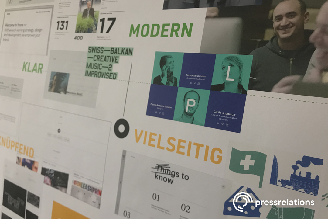
In this phase, the established basis gets “translated”. The discussion is around the following questions: which visual language fits, which look and feel best conveys the core values and which elements contribute to a coherent overall picture.
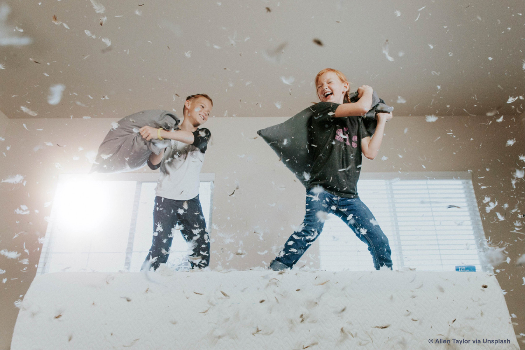
The visual result of our process is what you have before you today: a clean, modern and friendly appearance. Light, well-structured and accessible from many sides. It shows personality. On one hand, it uses a striking font and fresh, bold colors. On the other hand, it is showcasing our team and giving you a detailed look behind the scenes of pressrelations through photography.
PRESSRELATIONS SHOWS DIVERSITY
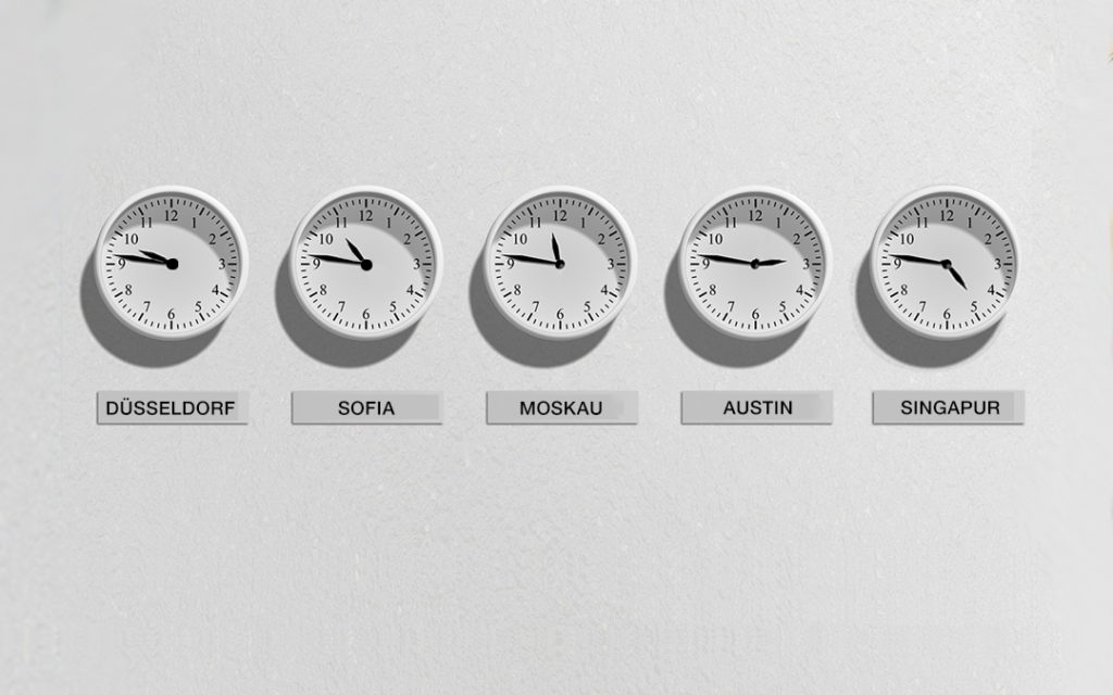
We show diversity: The pressrelations corporate color – green – was supplemented by a spectrum of green tones. This is how we visualize the diversity that you will find both in the wide range of products and the diversity of our teams. And also, the decision for an image with text as well as the choice of logo, which allows many associations, is based on this idea: pressrelations is versatile.
The most important thing for us was, of course, to make it possible to experience what makes us special.
Essentially these are the two poles: a binding way of working, a professional, friendly approach and a need-oriented, goal-oriented cooperation. This is true regardless of whether it is a matter of processing customer-specific or unforeseen requirements. Also, a forward-looking attitude – it ensures that we are constantly pushing our services, tools and performance further, intending to set new standards.